


Five NFC Business Card Designs That Instantly Grab Attention
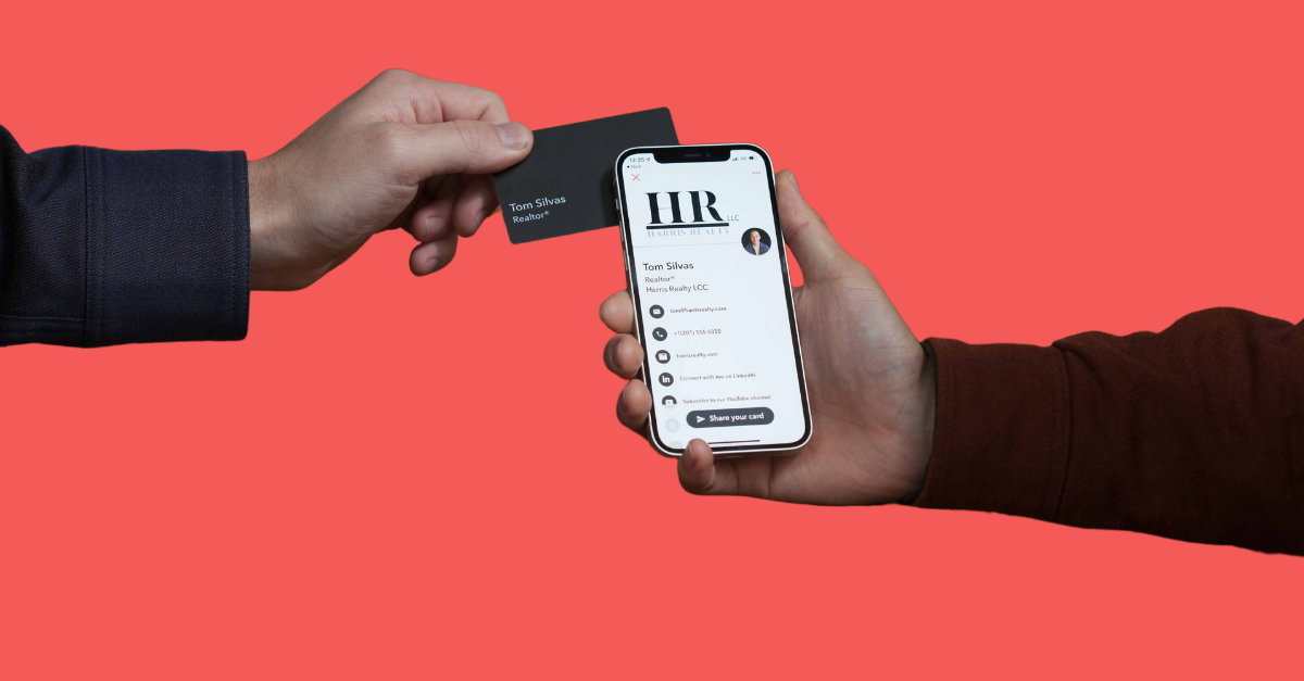
When you hand someone an NFC Business Card, you get one shot to impress. That one tap is your moment. So why settle for boring? Let’s look at five NFC card designs that turn heads. These are more than just cards. They’re tools that say you mean business and aren’t afraid to show it boldly.
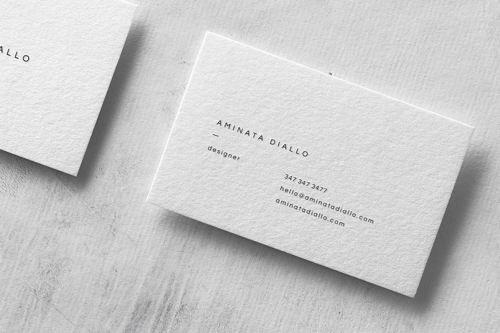
Minimalist with a Bold Accent
Clean designs speak louder than clutter. A white matte surface with just your logo in bright neon or foil embossing screams confidence. Pair this with a subtle NFC logo to invite interaction. Less noise, more signal, and every detail counts in first impressions.
Clients love this because it looks intentional. There’s nowhere to hide poor design when you opt for a minimalist approach. That’s the point. This design works best for creative professionals, consultants, and founders. Want to make it pop more? Use a bold accent color along the edge of the card. It’s subtle until they hold it and realize how sleek it feels.
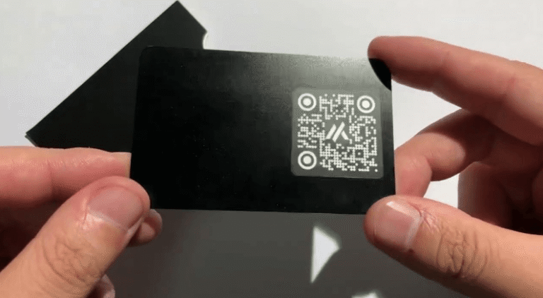
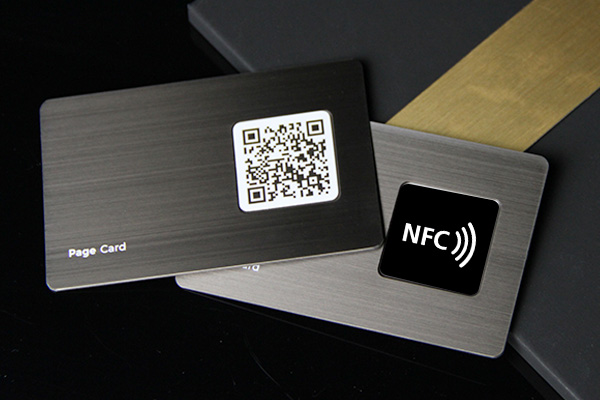
Full-Surface QR + NFC Combo
Double the access, double the effect. This design uses both a printed QR code and an embedded NFC chip. The whole card surface becomes an interaction point. One scan or one tap and they land on your portfolio, LinkedIn, or vCard, making follow-up effortless.
It feels smart. And practical. It works across phones with or without NFC, eliminating excuses and enhancing reliability. Use a high-contrast background to make the QR stand out. Avoid using white-on-white unless you want to elicit confused stares. This combo wins especially in tech or marketing circles that value accessibility.
Metal NFC Cards with Laser Etching
Talk about presence. A metal NFC card immediately conveys a sense of premium. The weight alone grabs attention before the chip does anything. Now etch your logo or pattern directly onto the surface. Industrial, sharp, and unforgettable for those who like to impress.
These are ideal for executives, luxury sales reps, or personal brands that lean upscale. Use stainless steel for clean aesthetics or opt for black titanium for a sleek edge. Don’t go overboard on copy. One line of contact info and the NFC tap is enough. Let the material do the heavy lifting with quiet strength.
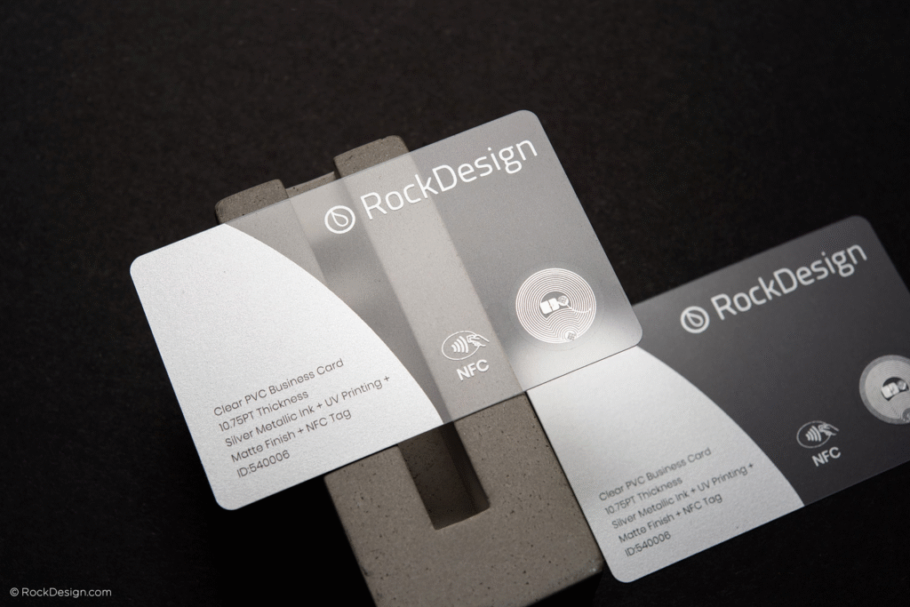
Transparent NFC Cards with UV Ink
A semi-transparent card feels futuristic. Add UV-reactive ink, and the whole thing glows under certain lighting. That visual pop makes people want to play with it—and that means they’ll remember you and probably talk about it too.
Pair transparency with clean, geometric design. No clutter. Highlight only your name, title, and logo. Tuck the NFC chip under a visible layer to spark curiosity. It’s especially popular in creative fields, such as fashion and entertainment, where flair meets function.
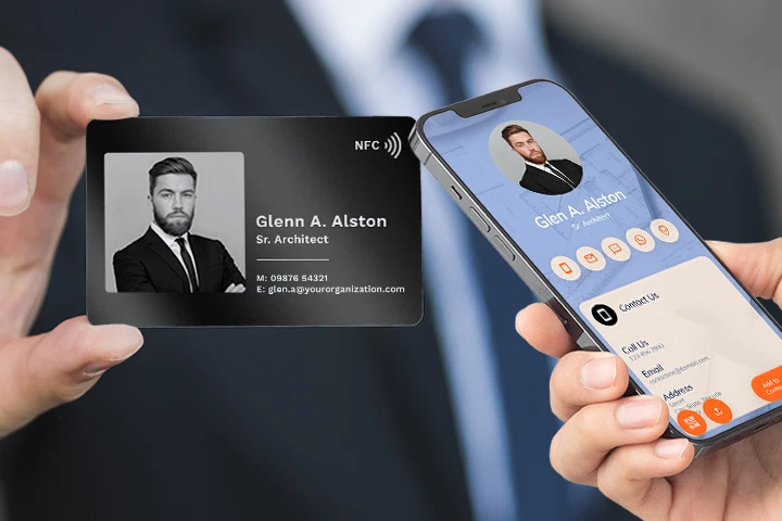
Interactive NFC Card with Dynamic Landing Page
Here’s where you make your card more than a static object. Link it to a dynamic, branded landing page. Your NFC Business Card becomes a digital handshake. Change the page for different events or campaigns to stay relevant.
Design the card to reflect your brand identity. Use patterns or textures tied to your landing page visuals. Add a CTA like “Tap for more” or “Connect instantly”. This works great for freelancers, event marketers, and anyone who needs to keep info fresh and exciting.
Design Tips That Work Across All Styles
Regardless of which of the five designs you choose, ensure that your card accurately reflects your personality. Utilize colors and materials that align with your brand’s values and identity. Don’t chase trends unthinkingly—own your look and feel. Test your card on different phones. NFC performance matters as much as looks.
Also, balance form and function. Avoid putting the chip too close to metal layers or overprinting the chip zone. Ask your vendor for samples and feedback. If you’re spending money to stand out, you should know how the final piece performs across real-world scenarios.
Common Mistakes to Avoid in NFC Card Design
Overdesign is the top sin. If it feels busy, it probably is. Don’t flood the space with too many icons, colors, or fonts. People scan or tap, not read novels. Another issue is the poor placement of the chip. If the tap zone isn’t apparent, people won’t use it confidently.
Then there’s the functionality side. A dead NFC chip equals wasted potential. Always test before printing large batches. And keep your digital links updated. Sending someone to a broken site defeats the whole point and makes you look careless.
Final Thoughts on NFC Business Card Design
An NFC Business Card is more than just contact info. It’s your brand, your voice, your tech-savviness all wrapped into one sleek object. Ensure it earns its keep and supports your objectives. Whether you choose metal, transparent, minimalist, or interactive, aim for something that people don’t want to throw away. Great design gets noticed. Great functionality gets used. Nail both, and your NFC card won’t just grab attention—it’ll hold it long enough to make a real impact.